
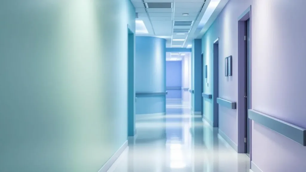
In the intricate world of healthcare, the power of colour psychology often goes unnoticed, yet it plays a crucial role in patient recovery and overall well-being. The colours that paint hospital walls are not merely aesthetic choices; they are strategic decisions aimed at fostering a healing environment. Research shows that different colours can significantly influence a patient’s mood and physiological responses, affecting elements like stress reduction, heart rate, and even recovery times. For instance, soft blues and greens are renowned for their calming effects, providing a sense of tranquility that can ease the anxiety many patients feel as they navigate the challenges of illness or surgery.
Conversely, harsh colours like bright reds and oranges can provoke feelings of agitation or discomfort. As healthcare facilities become more attuned to the needs of patients and staff alike, the thoughtful application of colour in design has emerged as a tool for enhancing patient comfort. From welcoming waiting areas to soothing patient rooms, each hue serves a purpose, aimed at transforming clinical spaces into places of refuge and healing. For healthcare designers and administrators, understanding the emotional and psychological impact of colour is no longer optional; it is essential for developing spaces that encourage positive patient experiences and outcomes.
The Psychological Impact of Colour in Hospitals
The correlation between colour and emotional well-being is profound in healthcare settings. Studies suggest that certain colours can evoke specific emotional responses, influencing everything from patient mood to staff morale. For instance, calming colours like soft blue or green are often employed in patient rooms and recovery areas. These hues are linked with serenity and healing, potentially lowering stress and creating a more supportive atmosphere.
In contrast, using intense or overly stimulating colours can heighten anxiety, especially in patients who are already under duress. The thoughtful choice of colour not only improves aesthetic appeal but serves as a vital component in creating a healing environment. This attention to detail is crucial for ensuring that healthcare spaces are not just functional, but also nurturing.
How Specific Colours Affect Different Areas of Hospitals
The strategic application of colour varies across different hospital areas, each tailored to meet specific needs. For example:
- Red is often reserved for emergency exits and danger signs, raising alertness but also stimulating circulation.
- Orange boosts energy levels and is appropriate for departments dealing with renal or reproductive health.
- Yellow aids digestion and is suitable for areas related to gastrointestinal health, promoting a sense of cleanliness.
- Green is synonymous with safety and healing, ideal for first aid stations and internal medicine departments.
- Blue promotes calmness, often found in surgical wards and patient recovery rooms.
By using colours that reflect the specific function and emotional response desired from each area, hospitals can facilitate a smoother journey for patients navigating complex healthcare systems.
Advantages of Colour Therapy in Patient Recovery
Beyond aesthetics, the use of colour in hospitals has tangible benefits for patient recovery. Integrating aspects of colour therapy can lead to lower anxiety levels and improved overall health outcomes. For example, studies indicate that patients in environments with carefully chosen calming colours often report reduced pain and stress. These spaces can also encourage better interactions between staff and patients, fostering a sense of trust and comfort.
As such, hospitals are increasingly re-evaluating their colour schemes to ensure they create an environment conducive to healing rather than merely focusing on cleanliness and functionality. This balance between clinical efficiency and emotional support is key to modern healthcare design.
Challenges and Considerations for Healthcare Design
Despite the benefits of colour in hospital design, challenges remain. The risk of creating overwhelming spaces with too many colours must be avoided; a focused palette of three to four cohesive shades can reduce confusion and enhance comfort. Moreover, cultural sensitivities regarding colour perception should be taken into account, as different demographics may respond uniquely to specific hues.
The aim should be clarity, where patients feel both informed and at ease in their surroundings. Additionally, the integration of natural lighting, coupled with colour choices, significantly enhances visual comfort, creating a holistic healing environment that addresses both physical and mental health needs.